Groxi
logo & UI design
The idea for this project came to me while I was doing my groceries during the ongoing pandemic.
It struck me how crowded the supermarket was even though the COVID regulations were already in place.
I thought that it would have been so much safer, if especially the most vulnerable people, who can’t rely on
others to do their shopping, could simply have it delivered.
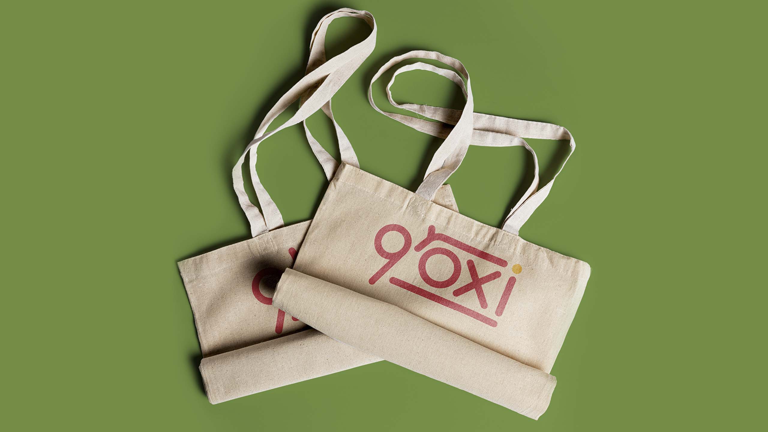
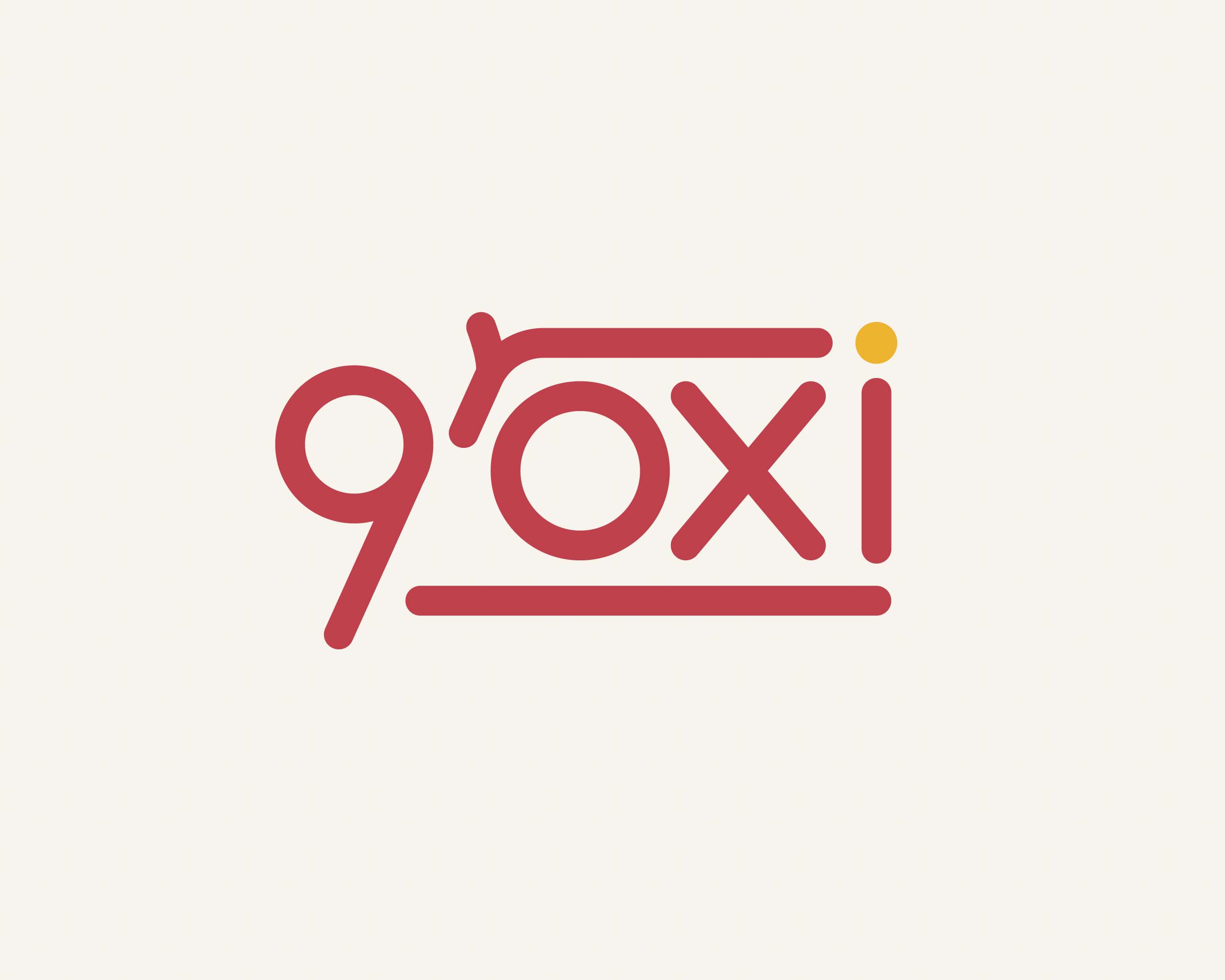
The idea behind the logotype was to make it resemble a shopping trolley without making it too obvious.
To achieve that result I used original letterforms.
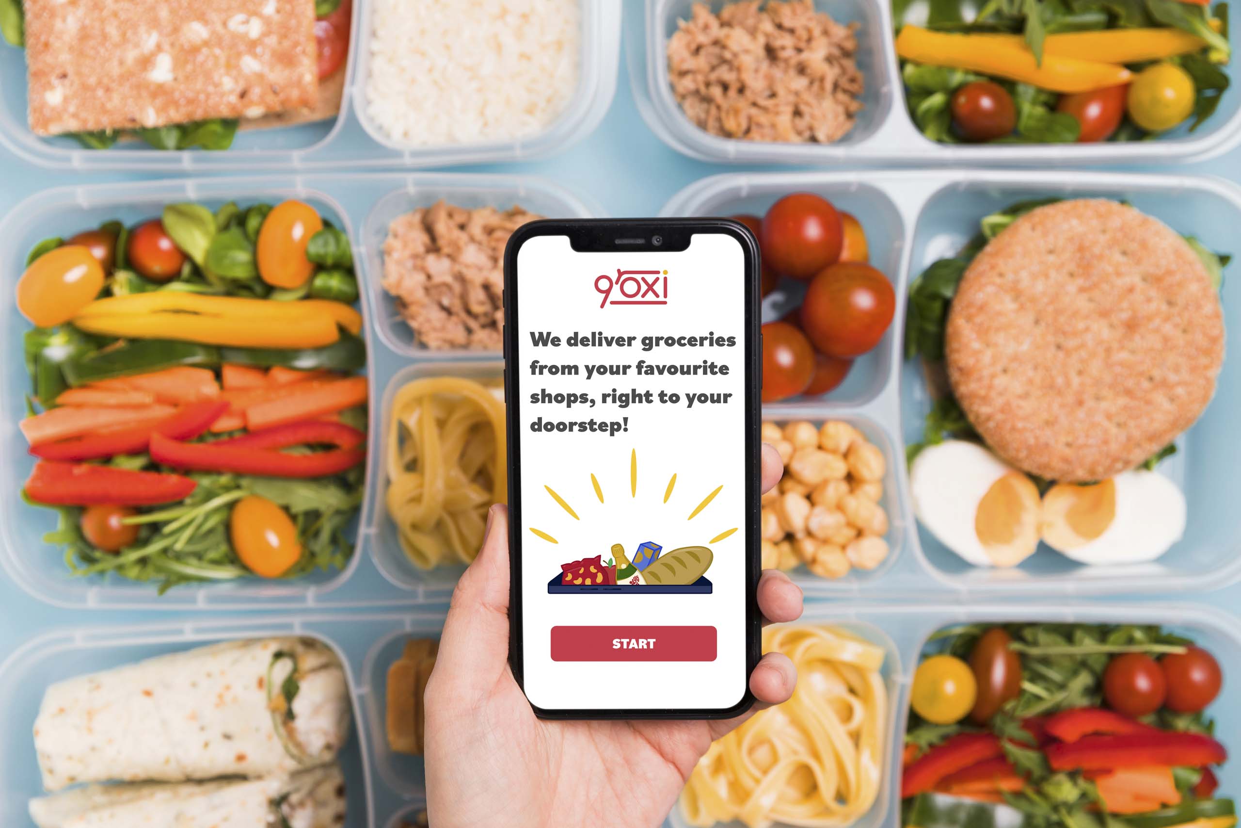
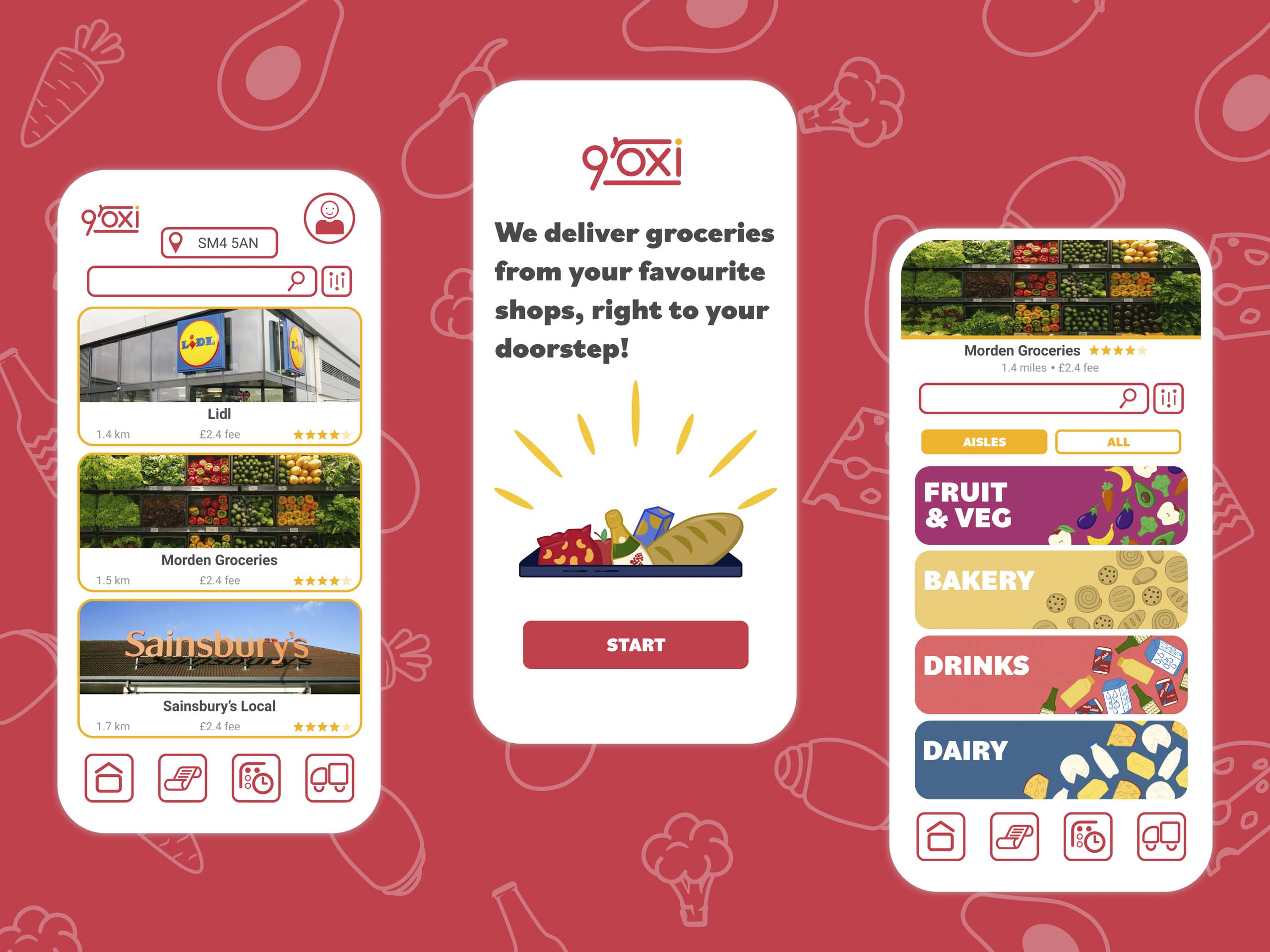
The challenge was to design an interface that will stand out from the already existing options on the market,
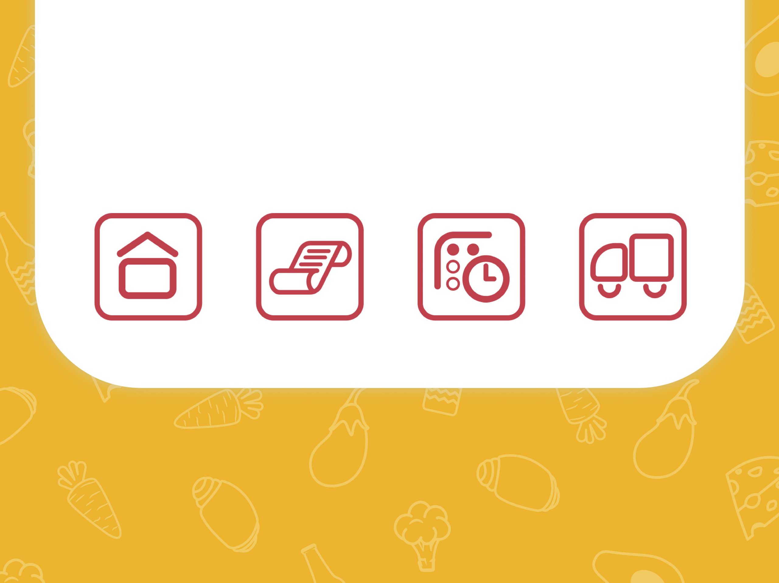
while making it look trustworthy and relatable for the customers. For that reason I decided to design, cohesive with the logo,
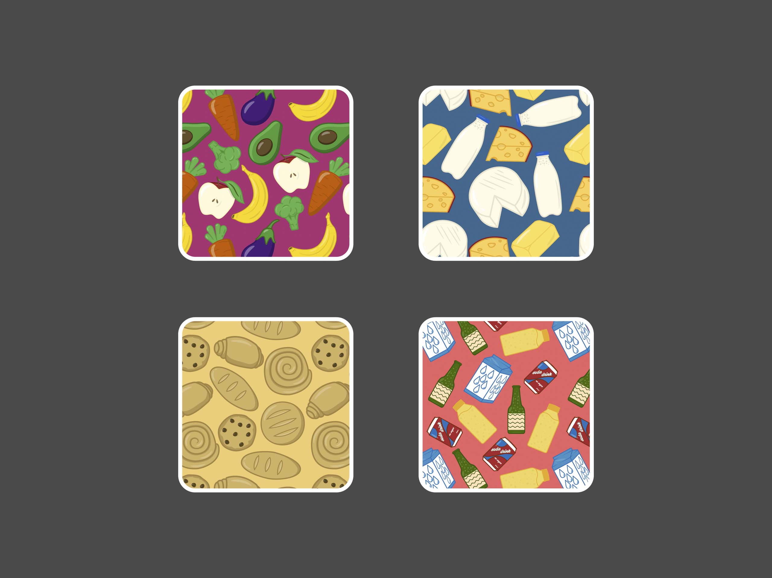
outline based interface with vibrant colourful illustrations.

