YEELIGHT
logo & packaging
Yeelight is one of the biggest smart lightning brands currently on the market.
Last year I purchased one of their products and now I can’t imagine my home without that variety of colours.
For a product so charismatic and youthful, I thought that the visual language of the brand didn’t communicate
its personality. I felt the need to redesign the logo and packaging of my new lightbulb.
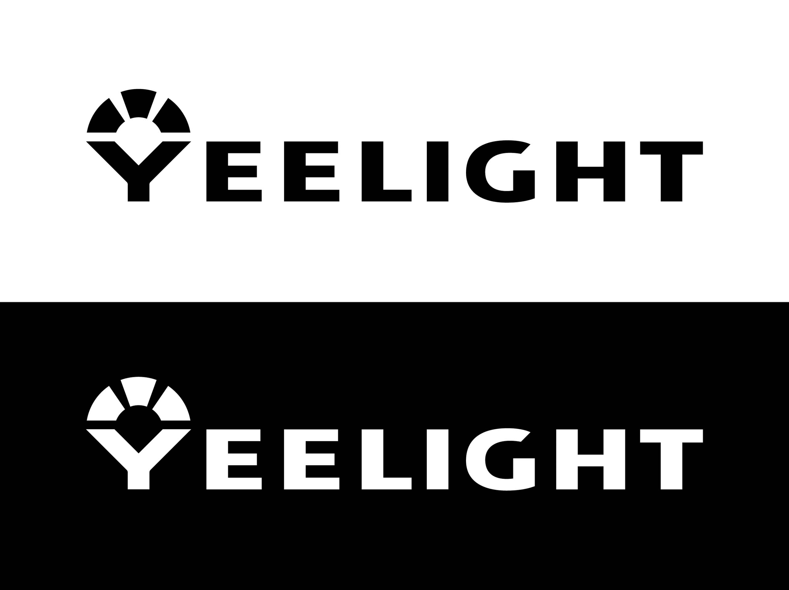
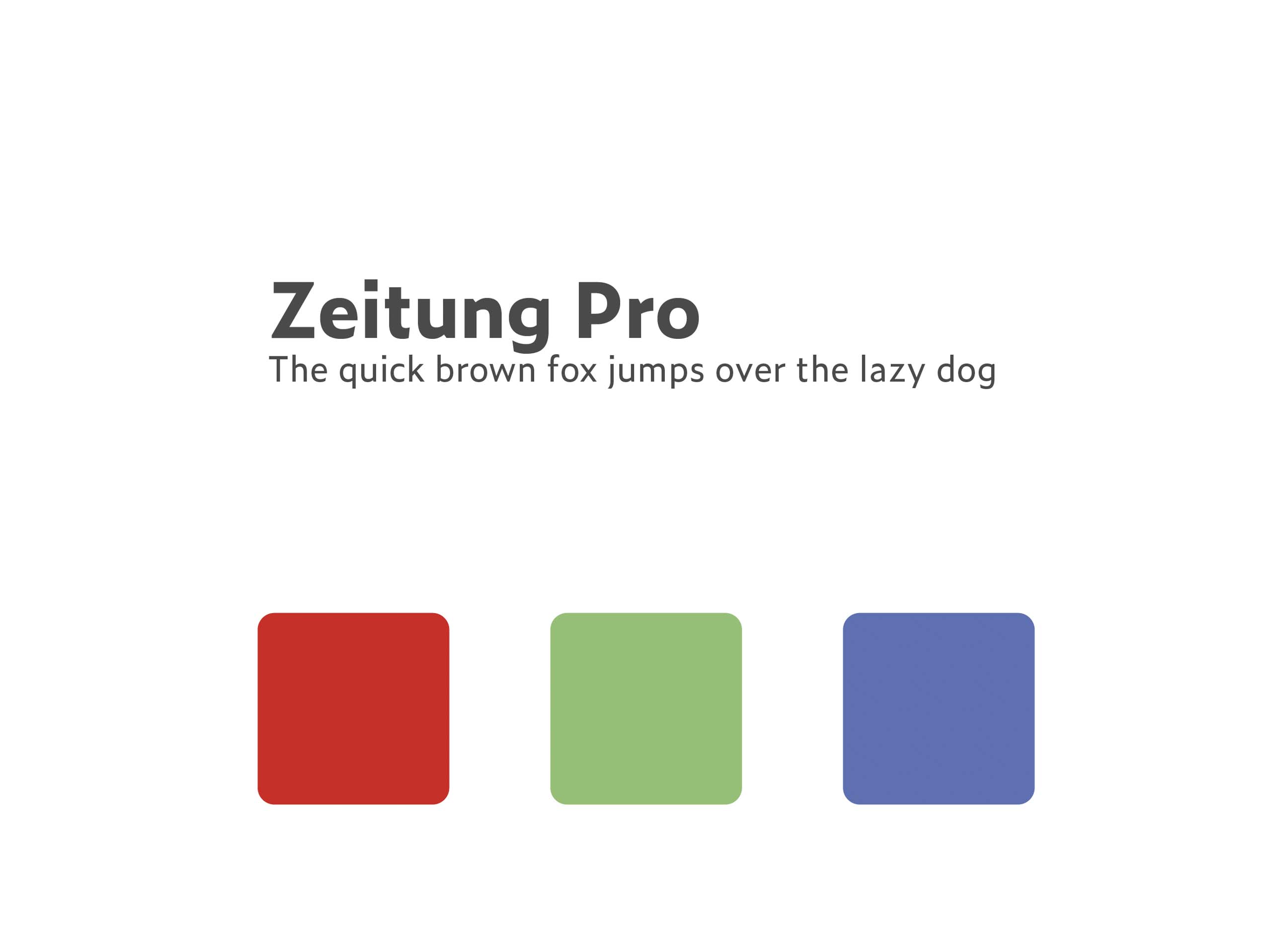
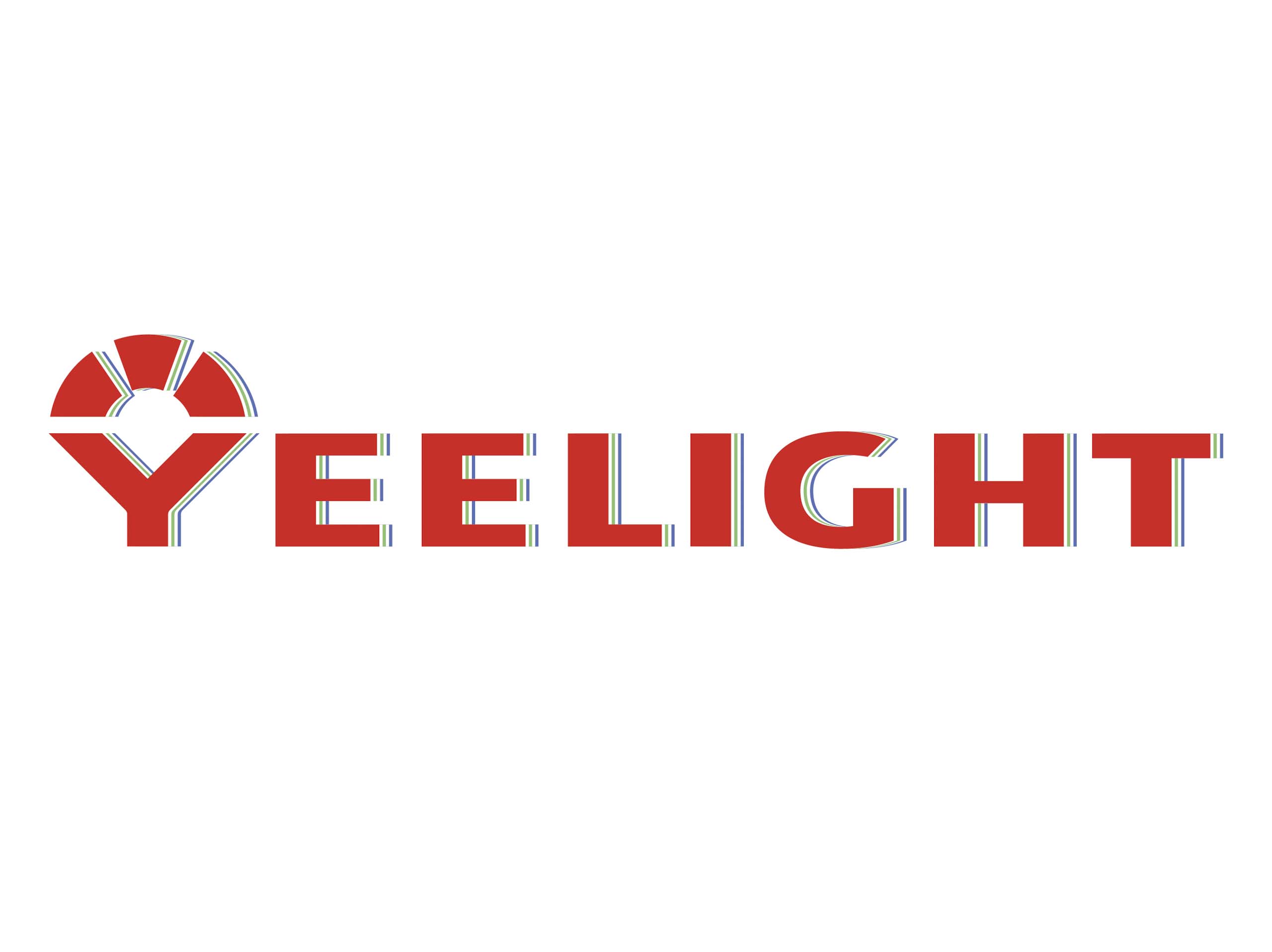
I created a bold bright logotype with a prominent red colour on top of green and blue outlines.
The colour palette speaks about the available lighting options as well as about the playful and versatile
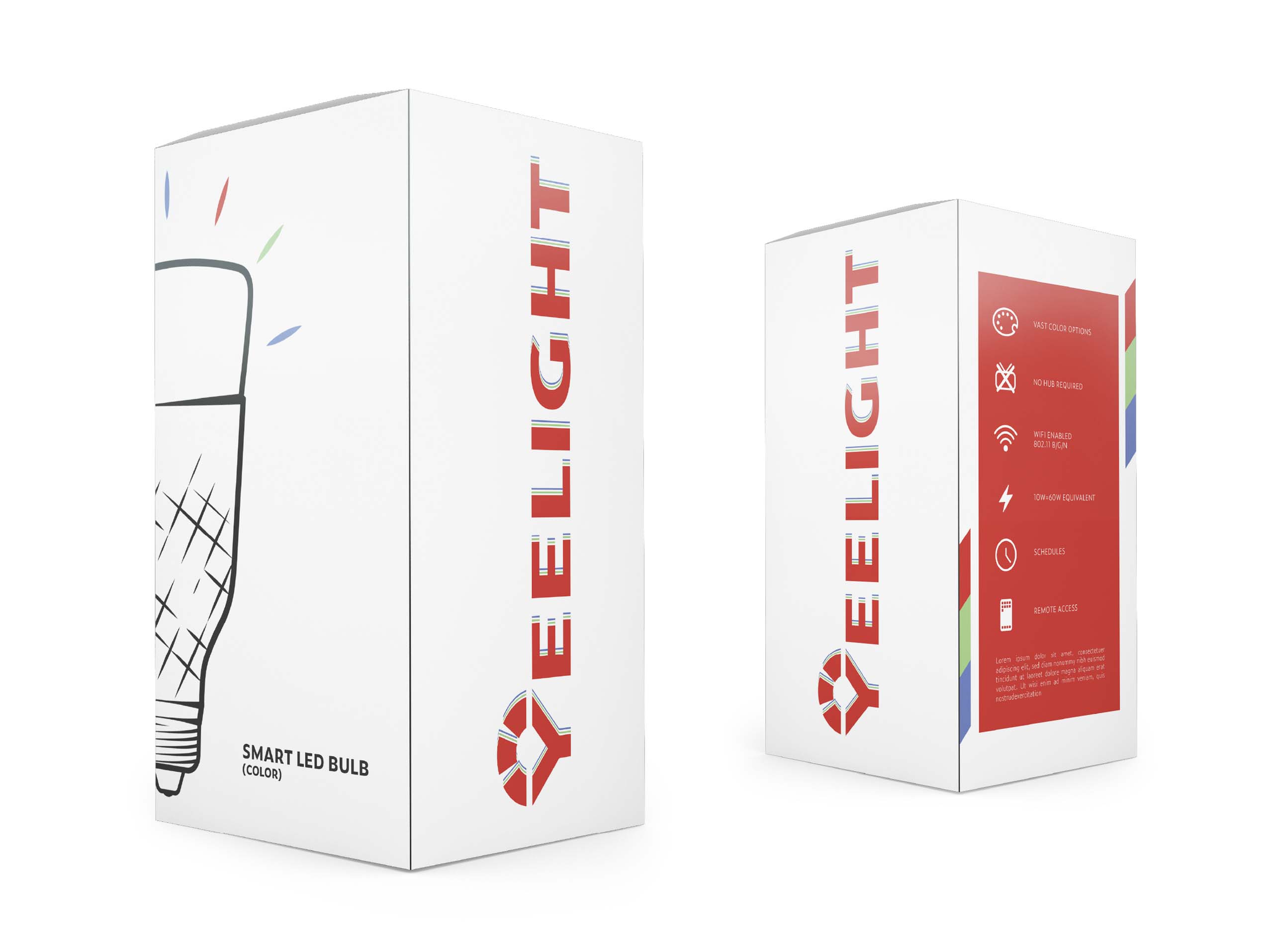
nature of the product. I chose a minimalistic approach for the packaging design. A simple lightbulb
illustration combined with the strong eye-catching logo sends a clear message about what’s inside
the box and sets the brand apart from the products offered by its competitors.
